- Home
- View on Github
- 30 Seconds Tutorial
- Developers
- Designers
- F.A.Q.
- Components
- - Action Card
- - Call To Action Bar
- - Call To Action Button
- - Center Aligned Headline
- - Hero Brand Two Buttons
- - Hero Subscription Form
- - Image Action Card
- - Image With Text
- - One Column Content
- - Simple Footer
- - Text With Image
- - Three Column Content
- - Three Column Footer
- - Two Column Content
- - Two Column Footer
- - Two Row Squares
- - Hero Background Image
- Templates
- - App Feature Page
- - Book Feature Page
- - Hero Landing Page
- - Open Source Project Page
- - Technical Documentation Page
- - Agency Landing Page
- Yelluw
This project is no longer under development.
Bootparts Documentation
Bootparts are a collection of Bootstrap 3 components that simplify the process of building websites. It encourages you to copy and paste code into your templates without having to worry about it not working. Each component is self-contained and has one direct dependency on Bootstrap 3. Combine as many components as you like and don't worry about a thing. Bootparts is for perfectionists with deadlines (a lá Django).
Best of all, a set of ready-to-customize templates are included. Just add your own styles and content. You can also use expand the templates by copying and pasting components into it. That's how they are built!
30 Seconds Tutorial
- Download the latest release here.
- Add the Bootparts CSS:
<link href="css/bootparts-minified.css" rel="stylesheet"> - Copy and Paste any component markup you may need.
- Add your content.
- Customize how it looks on your own CSS file.
- Enjoy the rest of your day because you are done.
Developers
- This project was desgined for ease of use.
- It performs well, but nothing has been optimized for speed.
- Feels quick because it does not use any Javascript as a default.
- The components were designed to be used in server side and client side rendering.
- Every component is self-contained.
- None of the components need Javascript to render or work.
- The Bootstrap navigation bar is not used, but you can add it.
- Please star the project on Github.
- It is released under the MIT license.
Designers
You can leverage this project to quickly build mock ups for your clients. You don't need to know Javascript, because all of the components are done in plain HTML / CSS. You are encouraged to copy and paste code (do the 30 second tutorial above). New components are planned for the near future. Star the project on Github to stay updated.
Components
Action Card

HTML
-
CSS
The action card component is used to include a clear call to action in any part of the layout. It is commonly
used to persuade the visitor to subscribe to a newsletter or download a resource. This is more useful than using
a pop up and provides a better user experience.
Call To Action Bar

HTML
-
CSS
The call to action bar is meant to be used at the top of the page. It includes a simple form
for visitors to input their email address. On smaller screens the bar collapses and the form stops being inline.
This is done on purpose to make it stand out.
Call To Action Button

HTML
-
CSS
The call to action button is meant to be used like the action card, except that this one is smaller and less intrusive.
You can also use it at the top of the page to alert users of a special event or offer.
Center Aligned Headline

HTML
-
CSS
The center aligned headline is used to break up the flow of copy and the movement of eyes between elements.
The contrast of dark background and white font is for the purpose of showcasing it. Note that it is not a <h1> tag, but a <p> tag.
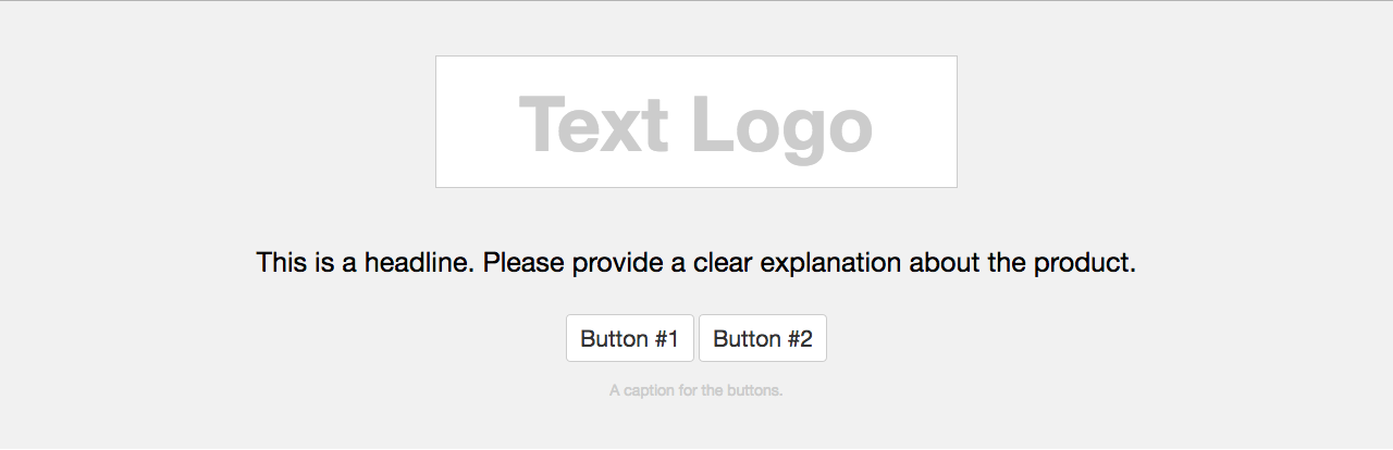
Hero Brand Two Buttons
HTML
-
CSS
The hero brand two buttons component is meant to be used above the fold. It features an area where you can put the brand name
of whatever product you are selling, a clear headline, two buttons, and a caption under the buttons. It was designed to
be used in the Bootparts project main page, but can be used to as a component with two call to actions. It does not collapse.
On smaller screens the headline stands out from the other elements on purpose. The headline is not a <h1> tag, but a <p> tag.
Hero Subscription Form

HTML
-
CSS
The hero subscription form component is used to persuade visitors to subscribe to an email newsletter. On smaller screens
the form covers the width of the screen (minus padding). This is done on purpose. It is meant to be at the top of the page.
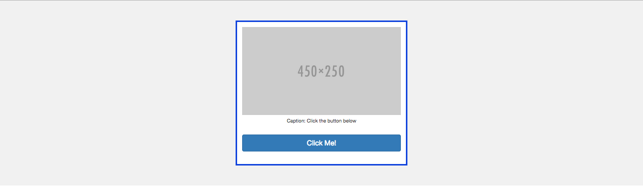
Image Action Card
HTML
-
CSS
The image action card component is used to include a clear call to action in any part of the layout. It is commonly
used to persuade the visitor to subscribe to a newsletter or download a resource. This is more useful than using
a pop up and provides a better user experience.
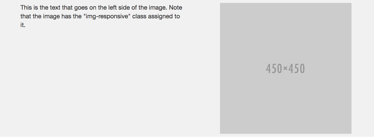
Image With Text
HTML
-
CSS
The image with text component has a two column layout. The image is make responsive with Bootstrap's img-responsive class.
It does not collapse. Smaller screens will see the side-by-side layout as well.
One Column Content
HTML
-
CSS
The one column content component was designed for text. It is useful for long form content. The line-height was adjusted
for readability.

HTML
-
CSS
The simple footer component is a standard plain footer. It does not collapse.
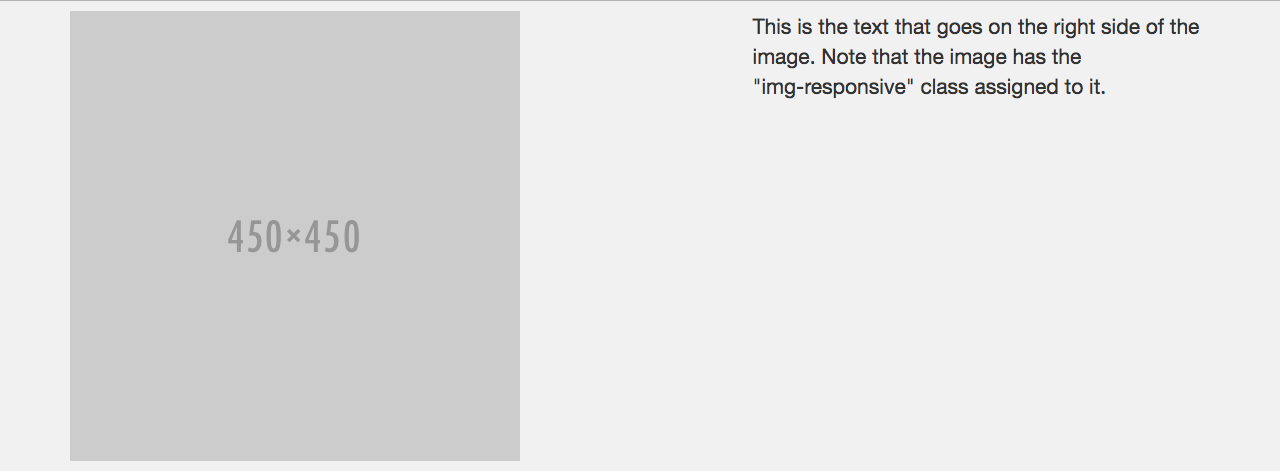
Text With Image
HTML
-
CSS
The text with image component has a two column layout. The image is make responsive with Bootstrap's img-responsive class.
It does not collapse. Smaller screens will see the side-by-side layout as well.
Three Column Content

HTML
-
CSS
The three column content component is used to state the benefits / features of a product. The default layout
includes an image on top, a title, and a content paragraph. You can replace the image with a text-based icon
and it won't affect anything. This component collapses on smaller screens.
HTML
-
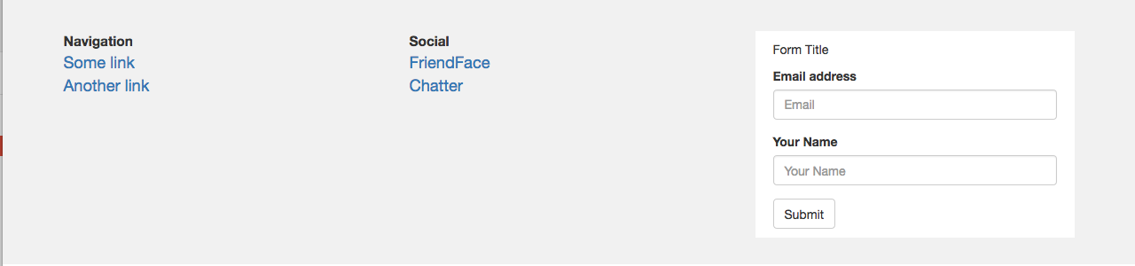
CSS
The three column footer component is a footer that includes a newsletter subscription form. Use it to try and persuade
visitors on the last part of your page. The component collapses on smaller screens. On smaller screens the form does
not extend the width of the container. It is set to be 400px wide on screens smaller than 768px.
Two Column Content

HTML
-
CSS
The two column content component was designed for content heavy pages that required a left-side navigation menu
(like this documentation page). It does not collapse.

HTML
-
CSS
The two column footer component was desgined for pages that lack a navigation bar and need to link to many
other pages. It collapses on smaller screens.
Two Row Squares
HTML
-
CSS
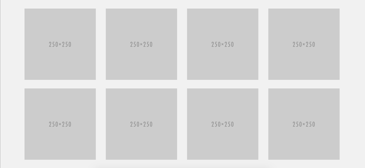
The two row squares component was designed for content that is presented in little blocks
of text or images. It is a small grid of eight items. Two rows of four items each.
Hero Background Image
HTML
-
CSS
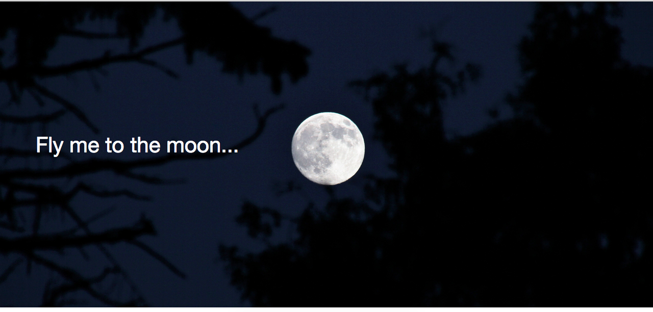
This component provides a way to drive a message with a background image and a line of text.
It was designed to be used with business slogans.
Templates
App Feature Page

Code
-
Demo
This page was designed to showcase mobile apps. It features a clear call to action in the header, a big image,
and a place for your copy. Simple and effective.
Book Feature Page

Code
-
Demo
This page was designed to showcase and sell books, e-books, online courses and similar information products.
It features two call to actions. One to purchase the product and one to demo it.
Hero Landing Page

Code
-
Demo
This page was designed to convert visitors. It features a prominent call to action. This is the classic marketing page layout.
Open Source Project Page

Code
-
Demo
This page was designed for Bootparts. It aims to provide a clear layout that other open source projects can leverage.
It's short and to the point with two clear buttons that can be used to link to the documentation or some other
important information or asset.
Technical Documentation Page

Code
-
Demo
This page was designed for Bootparts documentation. It features a two column layout that does not collapse
on smaller screens. The emphasis is on the content and nothing else.
Agency Landing Page

Code
-
Demo
This page was designed with agencies in mind. It is a multi-purpose business theme with
an aim towards service businesses.
Frequently Asked Questions
Q: Is the documentation available in other languages?
A: The documentation is currently available in English. No other languages are planned. Feel free to translate it. Make sure to open an issue on Github before you do.
Q: Under what license is Bootparts published?
A: MIT. Same as Bootstrap 3.
Q: Can I contribute?
A: I'm currently not accepting any kind of contributions because the project is under active development. Once it reaches v1.0, I will consider accepting contributions.
Q: Can you add a feature for me?
A: You can hire me at Yelluw to build whatever feature you may need. Unpaid feature requests are not accepted.
Q: I found a bug. How do I report it?
A: Go to the Github repo and open an issue. Please read the issue guidelines before posting.
Q: Do you accept pull requests?
A: Not at this moment.
Q: Is the project affiliated with Bootstrap?
A: No, it is not.
Q: Do you accept donations?
A: No. If you feel like donating money, please go donate it to the Bootstrap project.
Q: Why do the components and templates have marketing sounding terms / names to them?
A: Because I mostly do business / marketing websites. The components follow the naming conventions used internally. I work with digital marketing (among other things), thus the names.
Q: What is Yelluw?
A: It's a digital marketing and software development shop.
Q: Can I sell the templates?
A: Yes, the MIT license allow that.
Q: Can I turn one of the templates into a Wordpress theme?
A: Yes, the MIT license allow that. Do note that Wordpress themes require that you release them under the GNU GPL license.
Q: Why did you choose Bootstrap version 3 and not version 4?
A: Bootstrap version 4 had not been officially released when this project came to be. Version 3 is stable and provides a great base to build upon.
Q: Will a version supporting Bootstrap version 4 be released?
A: I don't know. Depends on whether I need to use the new features on some project.
Q: Can I port it to Bootstrap version 4?
A: Sure, just make sure to let me know in advance. That way we can collaborate together.
Q: What is the shelf life of this project?
A: This project will be supported for 5 years starting on the day the first commit was done. Don't confuse support with active development. New features will continue to be added as they are needed (by me, not you).
Q: Will new releases break backwards compatibility?
A: No. Backwards compatibility is something that I need. The project will not break it.
Q: I did not find an answer to my question in this F.A.Q., can I email you?
A: Open an issue on Github. Don't expect a prompt answer. Replies are provided when I get time.
Q: Who developed the code?
A: Pablo Rivera, a software engineer at Yelluw.